Manage quality is sometimes called as quality assurance. Oddly enough Quality Assurance and Quality Control are two project management activities quite commonly confused one for the other.
Controlling quality is simply about confirming that project output conforms to documented requirements.
Assuring quality is the way of looking at quality plan and quality control measurements of the project and making sure that organization’s quality standards, policies and processes are implemented on the project.
It is also a way to take feedback from the project and improve performing organization’s quality policies and processes.
The exercise of managing quality involves auditing project’s quality requirements and results from quality control measurements. The goal of this exercise is to continuously improve quality processes, eliminate activities that do not add value and share best practices from other projects in the organization with the project team.
If process improvements are identified and are to be implemented on the project, then project manager raises a change request to make necessary changes to project management plan.
As compared to other activities of project that are distributed to members based on skills, quality is one area that is 100% responsibility of every member on the team.
What do I need to manage quality on my project?
The inputs are obvious and simple.
Quality management plan
This defines the approach to implement performing organization’s quality plan on the project. This is the guiding document for all quality activities on the project.
Quality metrics indicate specific project or product attribute to be measured against specific values, along with any allowed variance. For instance, a software project may have a quality metrics on defects – zero critical defects, maximum of 2 major defects that have work around, and a maximum of 4 minor defects – for the deliverable to be passed.
Quality control measurements are used to compare the performance of quality activities against the measurements baselined for the project. Risk report is used to see which of the risks are either manifested or showing the possibility of occurring – and to assess their impact on quality of the deliverables.
How do I do it?
This activity is all about data – data collection, data analysis, and data representation.
The data that is collected using checklists and other tools are then analyzed using techniques such as root-cause analysis, process analysis, alternatives analysis, and so on.
This data is represented using many diagrams. Once represented they help us see trends, and proactively manage potential risks that threaten to impact quality of the project.
Let us look at some of the data representation diagrams.
Affinity diagram

Affinity diagram
Dictionary meaning of affinity is “a natural attraction or feeling of kinship”. When you have a group of ideas this method can be used to group them, and this is how it is done –
- Write an idea each on a card
- Look at each of the cards and see if it is related to any other idea
- Combine similar ideas together
- Continue this till all cards are used up, you can even have multiple rounds till all are grouped
This method can be used to create WBS.
Process decision program charts (PDPC)
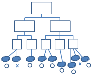
Process decision program charts (PDPC)
This technique is used to prepare contingency plans. This method identifies consequential impact of failure on plans, and create contingency plans to reduce risks.
Here is the procedure –
- Identify tree diagram of proposed plan, the last level of which has activities
- For each activity brainstorm what can go wrong
- Review all potential problems, remove improbable and insignificant ones
- For each problem brainstorm potential countermeasures (either to prevent, or remedy when problems occur)
- Use criteria such as cost, time required, ease of implementation and effectiveness, mark impractical ones with X and practical ones with O.
Interrelationship digraphs

Interrelationship digraphs
This is a tool to identify relationship among a group of issues. An Interrelationship digraph takes a group of issues, and establishes cause and effect relationship between them, helping you to identify seemingly minor issues that feed into major problems.
Tree diagrams

Tree diagram
The simple representation of hierarchical data such as work breakdown structure (WBS) or resource breakdown structure (RBS) or even organizational structures are examples of tree diagrams. The relationship between hierarchical levels is called ‘nesting’ relationship or ‘parent-child’ relationship. This is a great tool to visually group related information.
Prioritization matrices
This is used to list issues, identify alternative solutions, decide on the criteria to evaluate alternatives, prioritize them and apply to alternatives to arrive at rankings that represent priorities.
Activity network diagrams
Known as arrow diagrams, network diagrams, activity chart, node diagram, and CPM (critical path method) chart. These are used in project scheduling methodologies such as PERT (program evaluation and review techniques), critical path method and precedence diagramming method that we used in Sequence Activities process.
An activity network diagram shows required order to tasks in a project or process, best schedule for entire process, potential problems and solutions. With this one can identify critical steps that may impact overall duration of process.
Matrix diagrams
These show relation between 2, 3 or 4 groups of information. It then given relationship about relationship between these groups such as strength or roles played by different individuals. Six different matrices are possible – L, T, Y, X, C, R and then roof-shaped, depending on how many groups are to be compared.
Cause-and-effect diagrams
These are also called Ishikawa diagrams or fishbone diagrams, as we saw in Identify Risks process. This is a popular root cause diagram, where a root of a cause of problem can be traced by continuously trying to answer ‘why’ along each of the lines of symptoms.
Refer to the diagram below. Wrong measurements are one of the symptoms of Jogging track defects. And asking “why” has led to identifying that calibration of tools has been the root cause of this issue.

Fishbone diagram
Flowcharts
are used to show relationship between steps in a processes. Activities, decision points and order of processing are main constituents of flowchart. They can unearth potential problems in quality processes and help plug any gaps.
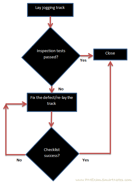
Simple flowchart
Pareto diagrams
are also called Pareto charts, named after Wilfred Pareto. This type of chart contains both bars and line. While bars represent frequency of occurrences (or some unit of measure), line graph represents cumulative values. Remember that bars are arranged in descending order of their heights (values) and line graph will always represent a concave curve.
Remember Pareto chart as his famous 80-20 rule, which states that roughly 80% of effects are caused by 20% of reasons. When a Pareto chart is plotted representing reasons for a particular problem, if you take care of top 20% of causes, they will address about 80% of the problems!
Here is a sample Pareto chart for Kathy’s Landscaping project from Procurement management knowledge area –

Pareto Chart for Kathy’s Landscaping project
Histogram
This is a graphical representation of distribution of data, shown as vertical bars representing characteristics of problem. The y-axis can show probability of the characteristic happening during problem situation, or simply the number of times this characteristic materializes during the problem situation.
Control charts
These are used to monitor repetitive quality processes for deviation from the mean. Control charts are also known as Shewhart charts (named after Walter A Shewhart) and are useful to verify whether a business process is in a state of control (or ‘stable’).
Each process under observation is defined upper and lower control limits and specification limits. If a process point falls outside of the control limit then action needs to be taken to bring it back the process within the control limits. Control limits indicate the maximum acceptable results without taking any corrective action on the process.
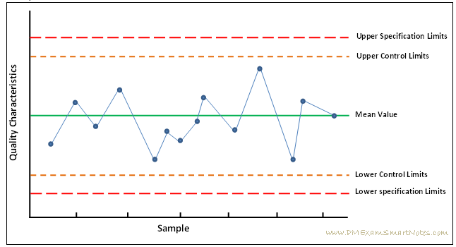
Control Chart
If seven consecutive points are found on any one side of the mean, or when a single data point is out of any one of the control limits the process is said to be out of control. This necessitates quick action by the project manager to see whether there is an issue in the product development process and get things back on track.
Scatter diagram
Also called Scatter Plot or Scatter graph is a type of mathematical diagram using Cartesian coordinates to display relation between two variables. One would be dependent variable and the other independent variable. Y-axis is used to plot the variable to be predicted (dependent variable) and X-axis is used for the variable to make prediction (independent variable).
Correlation refers to the degree of relationship between two variables. Degree of correlation can be found out looking at the plot. If the points are fairly random then correlation between variables is less (or ‘null’). If pattern of dots slope from lower left to upper right then it is called ‘positive’ correlation, and if pattern of dots slope from upper left to lower right then it is called ‘negative’ correlation.
An example of Scatter diagram is plot of two sets of variables, one representing height of an athlete (independent variable, on X-axis) and another representing weight (dependent variable, on Y-axis) – to find whether height has any correlation with weight of an athlete.

Scatter Diagram
As you can see, there is a ‘positive’ correlation between these variables. It appears that as height of an athlete increase she tends to weigh more.
Quality Audits
These are the process reviews done by performing organization’s quality assurance team. These will determine the extent to which project adheres to the quality policies, processes and guidelines given by the organization. For many a projects this is a soft point – where some of the proposed quality policies are not followed in the project. This is really double whammy – the project has to take the brunt of issues arising out of not following the processes and also deal with repercussions of not following company’s quality policies.
As a project manager, it would be a good practice for you to find about all policies prescribed by the organization upfront during project. Then critically look at their value on the project look at the cost of implementing them and corresponding benefits. Also, think of refining processes to suit project needs, and get a confirmation from project’s sponsor and performing organization’s quality assurance team on which of the policies will you be using on the project. This will avoid any issues later during quality assurance process.
Quality audits,
- Identify policies, activities and processes missed in the project
- Share best practices from other projects in the organization
- Offer help in implementing quality control activities, processes and guidelines
- Log the lessons learned during audit into organizational process assets
Due to these steps one can see improvements on the project in terms of reduced defects, improved productivity of quality control team, increased customer satisfaction.
Design for X (Excellence)
One of the earliest customization of design for a specific facet of manufacturing was documented in a report by British Productivity Council by the title “Design for Production: Report of a Visit to the U.S.A.” From them on it became a practice to design for ‘something’. For instance, Design for Tool-Less Assembly may have the components of a product that use press-fit (or snap-fit).
Hence design for Excellence in an aspect of production contains a set of rules, guidelines, or constraints that guide that aspect of production.
Design for X may cover quality, reliability, safety, manufacturing, assembly, maintenance, handling, and logistics and so on.
What to expect?
Whenever data is collected and analyzed, we should expect some kind of reports. Hence quality reports – graphical, textual, or numerical – are produced while managing quality on the project. Which then are used for controlling processes such as Procurements and Scope.
Test and evaluation documents are created and then used for control quality process.
Change requests are raised to suggest corrective or preventive actions that improve the company’s policies, processes and guidelines.
Many plans and project documents used for this activity may end up getting updated based on issues discovered in them, or changes made.
The logical next activity after managing quality is to control changes to quality processes. This we do to monitor and record quality management activities on the project in order to ensure deliverables are produced adhering to quality expectations. Let us look at how that is done now.